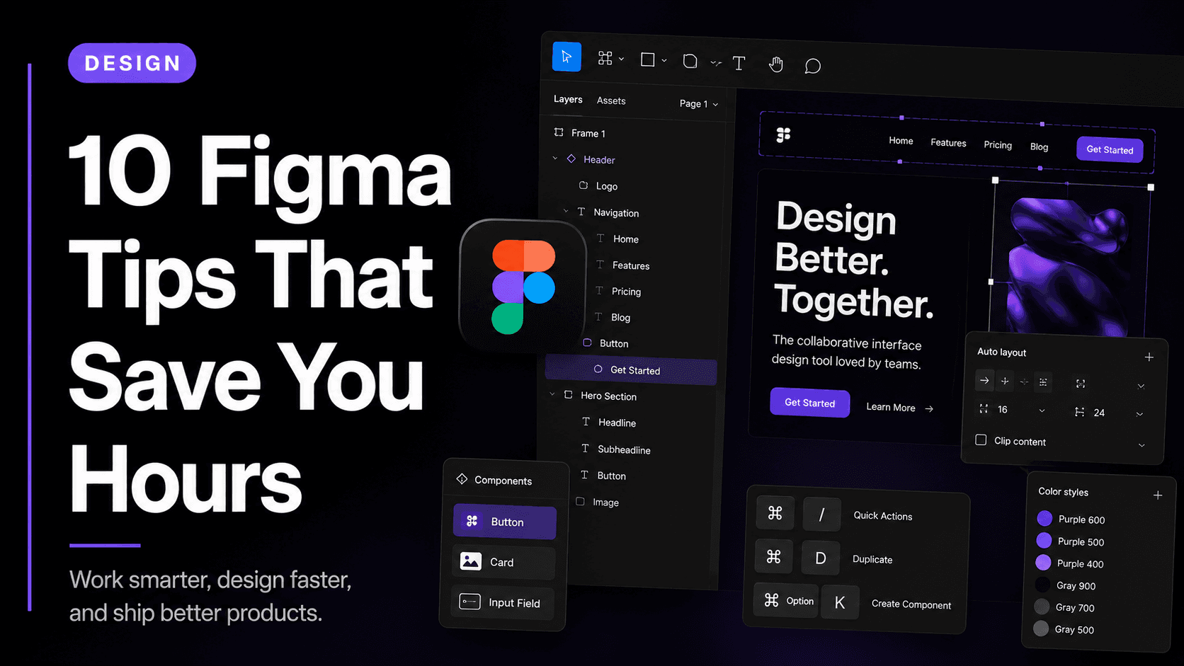
Small habits in Figma that make a massive difference to your speed and output quality. Most designers don't discover these until year two.
Figma is deceptively easy to start using and surprisingly hard to use well. Most designers spend their first year clicking and dragging, manually aligning things, wondering why their designs fall apart when the content changes. The tool isn't the problem — the habits are.
The following 10 habits are things experienced Figma designers do automatically. Once you internalise them, your speed will increase significantly and your files will become something your collaborators actually enjoy working in.
1. Use Auto Layout for everything
Auto Layout is the single most important feature in Figma. It makes your frames behave like CSS flexbox — elements stack, wrap, and resize automatically when content changes. If you're not using Auto Layout on every button, card, navbar, and page section, you're creating designs that will break the moment a developer or stakeholder changes a single word.
The habit to build is this: before you place anything inside a frame, apply Auto Layout first. Set your direction, your gap, and your padding. Then add your content. It takes five extra seconds and saves you twenty minutes every time the design changes.
2. Name your layers immediately
Unnamed layers — Rectangle 47, Frame 12, Group 8 — seem harmless when you have ten of them. When you have three hundred, your file becomes an archaeological dig every time you need to find something. Get into the habit of naming every layer the moment you create it.
Use descriptive, consistent names. 'Card / Product / Default' is more useful than 'Card'. 'Nav / Desktop' is more useful than 'Navbar'. Good layer names also help developers inspecting your file understand exactly what they're looking at.
3. Build components before you need them
The biggest time sink in Figma is making the same change in twenty different places because you didn't componentise early enough. Every UI element you'll use more than once — buttons, inputs, cards, icons, badges — should be a component from the start.
Components let you update one master and have the change propagate everywhere. Most designers wait until they're several screens in before creating components, by which point they already have fifteen manually-created button variations to reconcile.
4. Use variants for interactive states
Variants are components that share a property but have different states — default, hover, active, disabled, error. Instead of having four separate button components, you have one component with a 'State' property. This keeps your component panel clean and makes prototyping interaction states significantly faster.
When you set up your design system at the beginning of a project, plan your variants explicitly. Build all states upfront, even if you don't think you'll use all of them immediately. You will.
5. Learn the keyboard shortcuts
The keyboard shortcuts in Figma are not a nice-to-have — they are a fundamental part of working quickly. The ones that matter most: K to scale, R for rectangle, T for text, F for frame, A to select a child within a group, Cmd+D to duplicate, and Option+drag to duplicate in place.
Every time you reach for the toolbar, ask yourself if there's a shortcut instead. Within two weeks, the shortcuts will be muscle memory and you'll wonder how you worked without them.
6. Use Styles for colours and typography
Colour styles and text styles are Figma's equivalent of design tokens. If you define your brand colours as styles at the start of a project, you can update every instance of 'Primary Amber' across hundreds of screens by changing one hex value. If you've been hardcoding colours directly, you'll be doing find-and-replace manually for hours.
Set up your colour palette and type scale as styles before you design your first screen. This takes thirty minutes and will save hours by the time the project ends.
7. Keep your working file separate from your handoff file
Your working design file — where you're iterating, trying things, leaving half-finished explorations — should not be the same file you share with developers. Developers need a clean, organised, annotated file. Designers need freedom to make a mess.
When a design is ready for handoff, copy the finished screens into a dedicated file. Clean up the layers, add annotations, and share that file. Your working file stays messy and that's fine.
8. Use sections to organise your canvas
Sections are a relatively recent Figma feature that many designers still don't use. They let you label and group areas of your canvas — 'Exploration', 'Final Screens', 'Components', 'Archive' — and they show up as navigation items in presentation mode.
On any project longer than a few screens, sections are essential for keeping your canvas navigable. Without them, you end up scrolling through a canvas that looks like a Jackson Pollock painting.
9. Check your designs for accessibility
Colour contrast, touch target sizes, and text legibility are not afterthoughts — they're part of good design. Use the Stark or A11y plugin to check contrast ratios while you're designing, not after. Catching accessibility issues early takes 30 seconds. Fixing them after the developer has built the screen takes much longer.
Accessible designs are almost always better designs. High contrast text is easier to read for everyone. Touch targets sized for thumbs work better for mouse users too. Building this check into your workflow costs nothing.
10. Present directly in Figma
Many designers still export their work to slides for stakeholder presentations. This is unnecessary and creates a disconnect between what you're showing and what the product actually is. Use Figma's built-in presentation mode instead.
Presenting in Figma lets you click through prototypes in real time, zoom into specific components when stakeholders ask questions, and make changes on the spot. It demonstrates command of your tool and keeps the conversation grounded in the actual design rather than a static screenshot.